On this page
- Key numbers
- Why did we rebuild a design system we were already using?
- What did the AI site audit find?
- How did we choose a new design direction?
- How do you make a ribbon feel different on every visit?
- What changed in the colour palette?
- What did we fix before redesigning anything?
- What did it take, stage by stage?
- Where did the humans come in?
- What does the site look like now?
- What would we do differently?
- What can you take from this?
- FAQ
- How long did it take to rebuild the Flowtivity design system with AI?
- How many tokens did the redesign use?
- What is a multi-agent workflow in Claude Code?
- Did the AI make the design decisions?
- How does the ribbon change on each visit without slowing the site down?
- What went wrong during the project?
- Can a small business use this approach?
Short answer: Over two days, 24 and 25 September 2026, we used Claude Opus 5.5 in Claude Code, running multi-agent workflows, to audit the Flowtivity website, test four design directions, and ship a new version of our design system to production. The audit found that 83% of desktop scroll was text only and our ribbon brand art appeared on 1 of 15 pages. Four concepts were built as working mockups and scored by a panel of four AI judges. The winner, which we called Throughline, went live on Home, Services and Contact on 25 September. The Services page went from 11.2 desktop screens to about 6. The whole job used roughly 17 million subagent tokens, hit usage limits three times, and still needed a human at every decision point.
Key numbers
- 2 days: 24 to 25 September 2026, audit to production.
- About 17.4 million subagent tokens across the recorded runs (16.9 million in the runs listed below plus 483,522 for the final page-conversion agent), excluding the main orchestrating thread (at the time of writing).
- 109 audit findings. Sceptic agents confirmed 32, corrected 23, refuted none and added 11.
- 4 design concepts built as working pages, scored by 4 judges.
- 266 sitemap URLs checked after release.
- 11.2 to about 6: desktop screens on the Services page.
- 3 usage-limit interruptions, all recovered by resuming.
Why did we rebuild a design system we were already using?
Flow State, our design system, was in good shape on paper. One canonical token file, semantic colour names, Inter for all type, no gradients, content that reads without JavaScript. The homepage hero, a navy field with a satin teal ribbon, was the best thing on the site.
The problem was everything after the hero. When I asked for help, my brief was short: more flow, and more ribbons.
That is a vague brief. It is also the kind of brief most business owners give their designers. So rather than jump to a redesign, we started by measuring what was actually there.
What did the AI site audit find?
The audit was the first multi-agent workflow. An orchestration script (a small program that hands out jobs to separate AI agents and collects their results) split the site into four page groups. Each group got its own auditor agent, and each auditor was checked by a sceptic agent whose only job was to try to prove the findings wrong.
On top of that, four agents looked across the whole site through one lens each:
- design system and colour
- brand narrative
- benchmarks against other sites
- quantitative rhythm (how much of each page is text, image or colour)
A final agent pulled it all into one synthesis. That run used 3,528,535 tokens, 13 agents and 1,156 tool calls over about two hours.
The findings were uncomfortable and specific.
- 83% of desktop scroll was text only (84% on mobile). Pictures covered 3 to 6% of our pages. The benchmark sites ranged from 20 to 65%.
- The ribbon appeared on 1 of 15 pages, about 285 pixels out of roughly 100,000 pixels of desktop scroll.
- Our "pale" section colour was 1.05:1 against white. In practice, invisible. Every page read as navy, then one long white sheet, then navy.
- Brand flow scored 1.5 out of 5 on average, the weakest of six dimensions. The homepage never used the word "flow".
- The Services page ran 11.2 desktop screens, with a single continuous light run of 9.4 screens.
It also found things that mattered more than any visual change:
- Retired products were still linked from the footer of every page, including a form that posted to an API returning "gone".
- Our Private AI page promised "servers you own" while recommending rented GPUs.
- Some industry and city pages carried percentages we could not back up, and some FAQs ranked us against competitors.
A sceptical buyer could disprove each of those in minutes. As the synthesis put it: "One overclaim caught discounts every true number on the site, including the genuinely strong ones."
The sceptic step earned its keep. Of 109 findings, sceptics confirmed 32 and corrected 23. They refuted none outright, but they added 11 findings the auditors had missed. Without that step, roughly one in five findings would have reached me slightly wrong.

How did we choose a new design direction?
The audit ended with a colour direction, a ribbon brief and five concept seeds. From those, a second workflow built four concepts as real, working mockups rather than mood boards:
- The Thread: one ribbon that runs through the page and carries the story.
- Stuck → Flowing: before and after states for every process we describe.
- Working Drawings: a technical drawing language, like an engineer's plans.
- Tide: a rhythm of surfaces and navy bands that rise and fall down the page.
Each concept was then scored by four judge agents, each playing a different reader: an art director, a sceptical small business buyer, a front-end engineer and a brand strategist.
The averages were close at the top: Tide 7.58, Thread 7.25, Stuck 6.46, Drawings 6.25. But three of the four judges ranked Thread first. So the highest average and the favourite were different concepts, and that disagreement was worth paying attention to.
The synthesis agent did not just pick the top score. It recommended a hybrid it called Throughline: Thread's design running on Tide's engine. Thread's ribbon and storytelling, with Tide's surface rhythm and component system underneath. I agreed, and that became the direction.
This run did not go smoothly. The first attempt used 1,857,086 tokens across 9 agents before a usage limit stopped it mid-build. We resumed it. Finished agents were reused from cache rather than rerun, and the resumed run used another 3,410,688 tokens across 13 agents. A later revision pass hit another limit and picked itself back up after the reset, using 423,768 tokens.

How do you make a ribbon feel different on every visit?
Midway through, I added a request: the ribbons should "feel different every visit". That is easy to say and easy to get wrong. The obvious answer is live 3D in the browser. Our own rules rule that out: no WebGL, no video backgrounds, and marketing content has to read before any JavaScript runs.
So the work split in two.
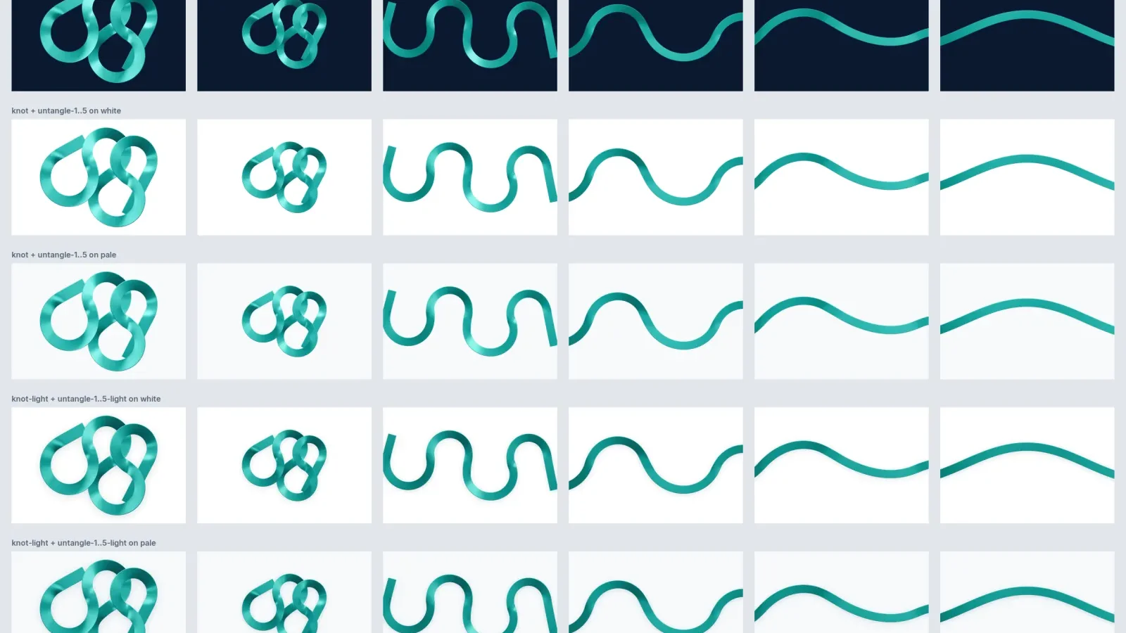
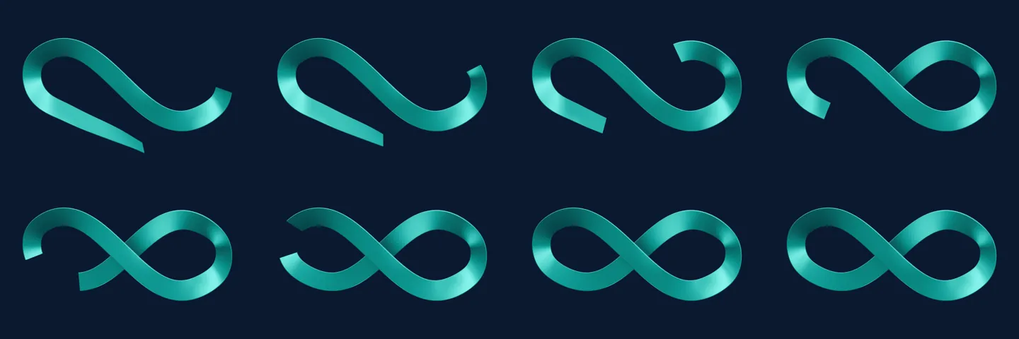
First, a ribbon family. A single agent spent about 74 minutes (360,622 tokens, 124 tool calls) writing a seedable Blender script. "Seedable" means you give it a number and it produces the same ribbon every time, so any variant can be reproduced exactly. From that one script came a family of shapes: a knot that untangles into a line, wave and fold transitions between sections, a vertical spine, small glyphs and a ribbon that passes through a card. All were rendered on navy, white and the light surfaces.
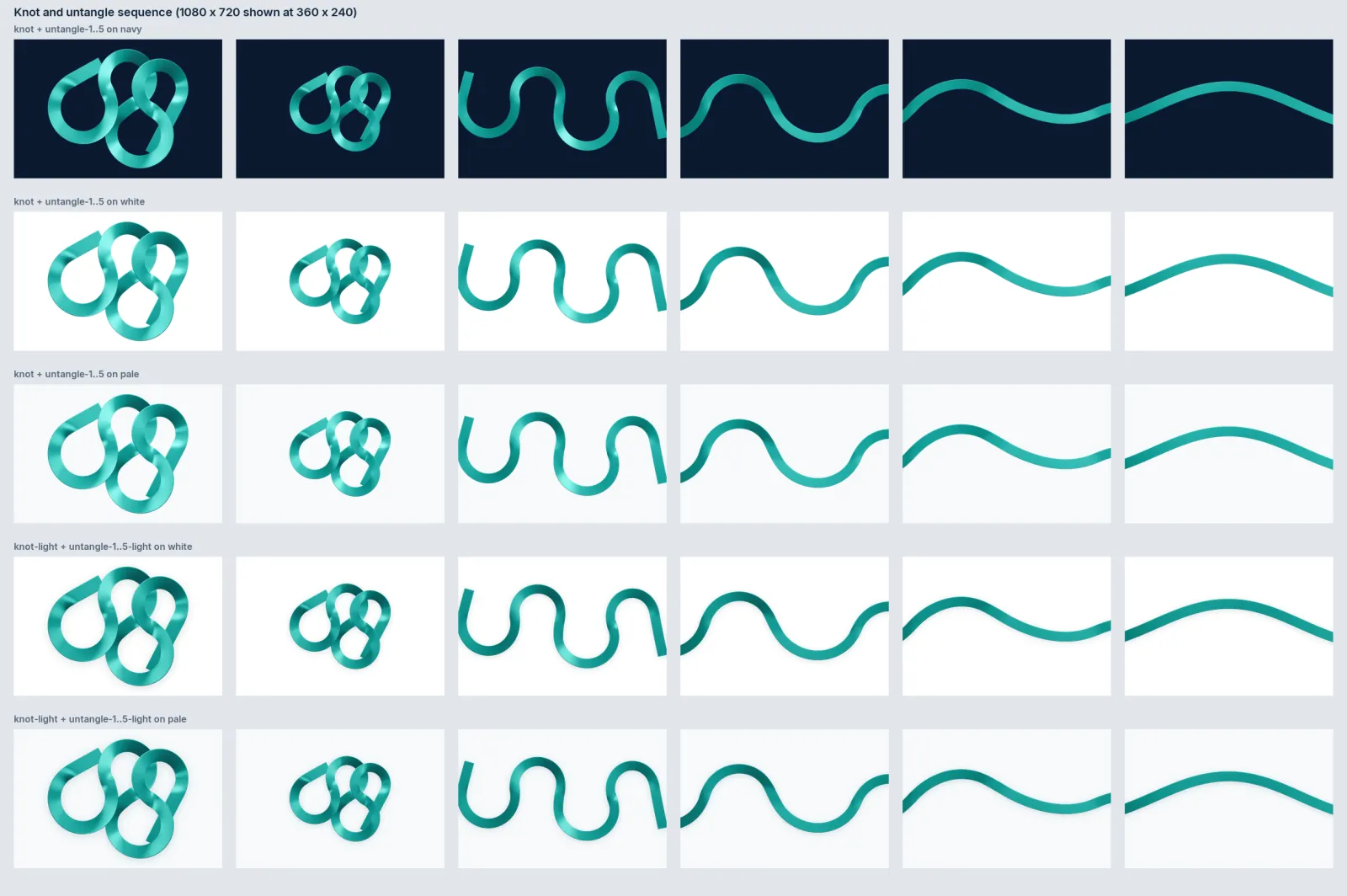
Second, a small pre-paint script. Before the page draws, a tiny script picks one of several curated, pre-rendered ribbon variants for that visit. It also remembers where the ribbon left the previous page, its "exit lane", and starts the next page's ribbon from the same side, so moving through the site feels continuous. If JavaScript is off, you simply get the full default ribbon. Nothing breaks and nothing is missing.
That is the pattern we would recommend to anyone asking for "something different every time": curate a small set of good options in advance, and let the page choose between them. You keep control of quality and the page stays fast.
What changed in the colour palette?
The audit was blunt about colour. The palette passed accessibility checks, but as a brand it was thin. Teal did every job, links, bullets, heading words, so it no longer meant "you can click this". And the light surfaces could not create rhythm because nobody could see them.
The new palette, Flow State 4 (we called it 3.1 during the project), keeps navy, ink, white and the rule of one accent per surface. It adds:
- Mist, a visible cool surface that replaces pale. At 1.116:1 against white, the shipped mist is more than double pale's visible step.
- Sand, a warm surface for sections about people: the founder, reviews, quotes.
- Navy-800, for cards and diagram nodes on navy.
- A ribbon colour ramp taken from the rendered ribbon itself, for artwork, dividers and diagram strokes, never text.
It also retunes the teal action colour so it passes AA contrast on every light surface. The old teal passed on white but failed on mist and sand. The audit's recomputed value lifted it to 5.54:1 on white and just under 5:1 on mist and sand.
A small rule came with it: systems sit on mist or navy, people sit on sand. You can see it on the new homepage, where the founder section and reviews are the one warm band.
What did we fix before redesigning anything?
Before any new design shipped, we ran what we called Phase 0: fixing the things that were broken or untrue. Retired Insights pages redirected or hidden, unprovable claims removed (a Private AI "servers you own" line next to rented GPUs, invented percentages, self-ranking FAQs), seven legacy clip-art illustrations deleted, one booking path to a 1-hour consult, a new Gold Coast page, and breakage on inner pages. None of it is glamorous, and all of it matters more than a ribbon.
Phase 0 was the biggest run of the project: 4,501,368 tokens, 11 agents and 1,522 tool calls over about four hours. A usage limit hit during the fix stage, and the resume took another 448,287 tokens. It shipped to production on 25 September.
A separate verification run (360,423 tokens, 2 agents, 181 tool calls) then checked all 266 URLs in the sitemap on the live site.
If you take one thing from this case study, take this order. Fix what a buyer can disprove first. Then make it beautiful.
What did it take, stage by stage?
| Stage | What ran | Agents | Tokens | Time | Outcome |
|---|---|---|---|---|---|
| Site audit | 4 page-group auditors, each checked by a sceptic; 4 cross-cutting lenses; 1 synthesis | 13 | 3,528,535 | About 2 h | 109 findings: 32 confirmed, 23 corrected, 0 refuted, 11 added |
| Ribbon lab | 1 agent writing a seedable Blender script | 1 | 360,622 | About 74 min | Ribbon family: knot, untangle, transitions, spine, glyphs, through-card |
| Concepts, first run | Build 4 concept mockups | 9 | 1,857,086 | Not recorded | Stopped by a usage limit mid-build |
| Concepts, resumed | Finish 4 mockups; 4 judges; synthesis | 13 | 3,410,688 | Not recorded | Tide 7.58, Thread 7.25, Stuck 6.46, Drawings 6.25. Throughline recommended |
| Revision pass | Revisions to the chosen direction | Not recorded | 423,768 | Not recorded | Resumed on its own after a limit reset |
| Prototype build | 1 agent | 1 | About 343,000 | Not recorded | Interactive prototype for AJ's review |
| Owner copy update, QA, fix | Copy changes, checking, fixing | 3 | 1,254,504 | Not recorded | Copy questions resolved; prototype updated |
| Phase 0 site fixes | Fixes across the live site | 11 | 4,501,368 | About 4 h | Limit hit in the fix stage |
| Phase 0 resume | Finish the fix stage | Not recorded | 448,287 | Not recorded | Shipped to production, 25 Sept |
| Post-release verification | Live checks | 2 | 360,423 | Not recorded | All 266 sitemap URLs checked |
| Throughline build | 1 agent building into Next.js | 1 | 422,063 | Not recorded | Home, Services, Contact live, 25 Sept |
| Inner pages to Throughline | Case studies, Private AI, About, Industries, Gold Coast | 1 | 483,522 | About 79 min | Shipped to production, 25 Sept |
| Total | About 17.4 million | Excludes the main thread |
The table covers subagent tokens only. It does not include the main thread that planned and coordinated the work, which was substantial in its own right.
Where did the humans come in?
This was not a hands-off job, and it should not be. I was the reviewer at every point where taste or truth was at stake.
- I approved the direction. Throughline was a recommendation. It became the plan only when I said so.
- I answered copy questions the agents could not answer themselves: that the first call is a 1-hour consult, how we position Australian cloud hosting, and how to explain the NPS figure from our On Course Golf cohort.
- I chose the case study to feature. We highlighted the pre-estimate review agent we built for a national renovation contractor, because it shows the whole idea in one picture: the agent checks every estimate, and an estimator makes the call.
- I reviewed an interactive prototype published as a private page, clicking through it on desktop and phone before any production code changed.
The agents were fast at producing options and checking each other. They were not the right judge of what we can honestly claim, or what our clients would recognise as true. That stayed with me.
What does the site look like now?
Compare the Services page before and after.
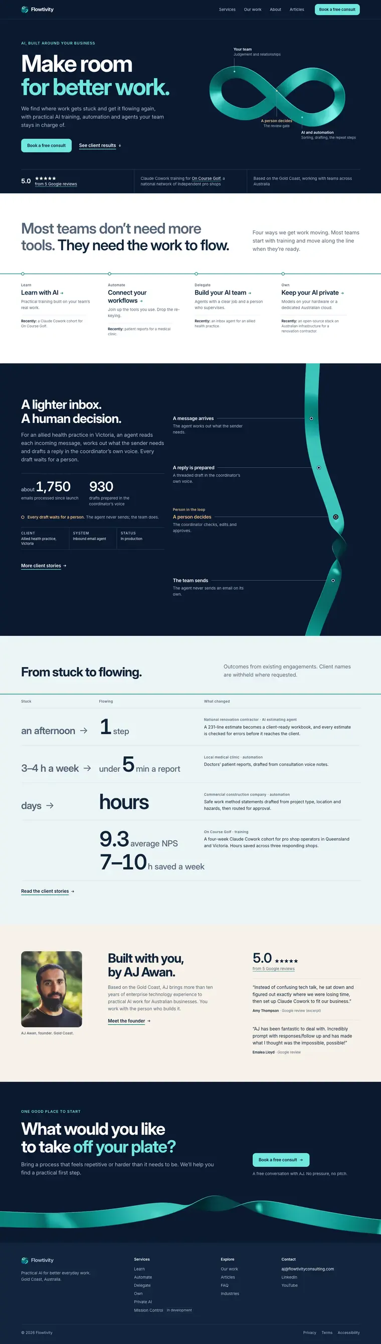
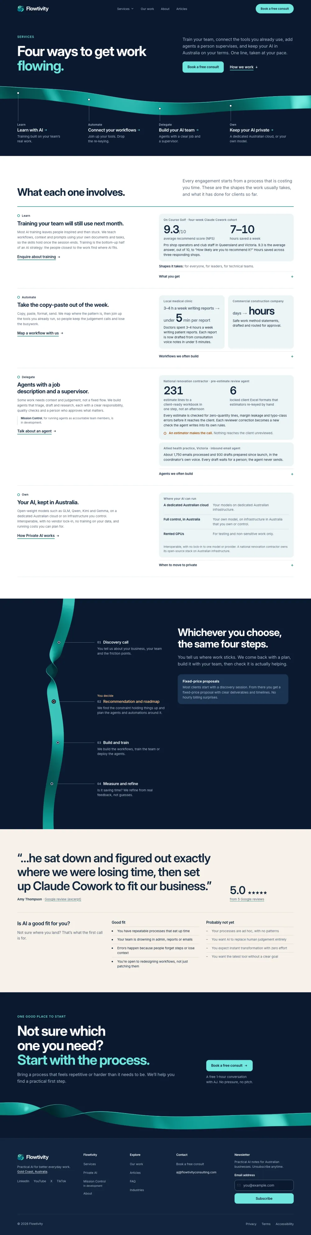
Before, it was a long white sheet: four service sections, each with a clip-art illustration, a card grid of training programs, a cost section with traffic-light tiers, and ten different closing calls to action across the site.
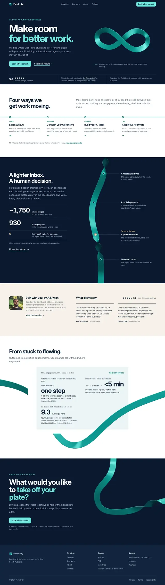
After, it opens on navy with the ribbon running under four clear offers: learn, automate, delegate, own. Each offer sits beside real proof from a named or described client. A mid-page navy band carries the four-step process along the ribbon's spine. A warm sand band holds a client quote. It ends with one call to action. It is about 6 desktop screens instead of 11.2.
What would we do differently?
- Plan for usage limits from the start. Three runs were cut short. Resumable runs saved us, but we lost time each time. Next time we would split the largest runs into smaller stages.
- Budget honestly. About 17.4 million subagent tokens is a lot for a small consultancy's website. It bought a thorough audit and four real options, but a smaller job could run on one concept and one judge.
- Fix truth before taste. We did, and we would do it again. The Phase 0 fixes probably matter more to a buyer than any ribbon.
What can you take from this?
You do not need 17 million tokens to try the core idea. Pick one page on your site that matters, perhaps your services page. Ask one AI agent to audit it, and a second agent to try to prove the first one wrong. Then ask yourself: which of these findings would a sceptical customer notice first?
That one experiment will tell you more about your site than a redesign brief will.
When the work is set up this way, AI stops being a design gimmick and starts being a careful second pair of eyes. There is more possible than most of us realise.
FAQ
How long did it take to rebuild the Flowtivity design system with AI?
Two days. The audit started on 24 September 2026 and the new design went live on Home, Services and Contact on 25 September, after a round of fixes to the existing site shipped earlier the same day.
How many tokens did the redesign use?
About 17.4 million subagent tokens across 11 recorded workflow runs. That excludes the main orchestrating thread. The single largest run was the Phase 0 site fixes at about 4.5 million tokens.
What is a multi-agent workflow in Claude Code?
It is a script that hands separate jobs to several AI agents at once, then collects and combines their results. In our audit, four agents reviewed page groups, four checked their work, four looked across the whole site, and one wrote the summary.
Did the AI make the design decisions?
No. The agents built options, scored them and made recommendations. AJ approved the direction, answered copy questions and reviewed an interactive prototype before anything shipped.
How does the ribbon change on each visit without slowing the site down?
A small script picks one of several pre-rendered ribbon images before the page draws, and carries the ribbon's exit point to the next page. With JavaScript off, visitors see the full default ribbon. There is no 3D rendering in the browser.
What went wrong during the project?
Usage limits stopped three runs partway through. Each was resumed, with finished agents reused from cache, but each interruption cost time and extra tokens.
Can a small business use this approach?
Yes, at a smaller scale. Start with one important page, one auditor agent and one sceptic agent that tries to disprove the findings. Fix anything a customer could prove untrue before changing the design.
One email a month, no noise
Practical AI notes for Australian businesses. Unsubscribe anytime.